photo-eye GalleryGallery Favorites
Interview with Christopher ColvilleBy Alexandra JoChristopher Colville speaks with Gallery Assistant Alexandra Jo about his process and inspiration behind his unique photographic works in Flux.
by Alexandra Jo
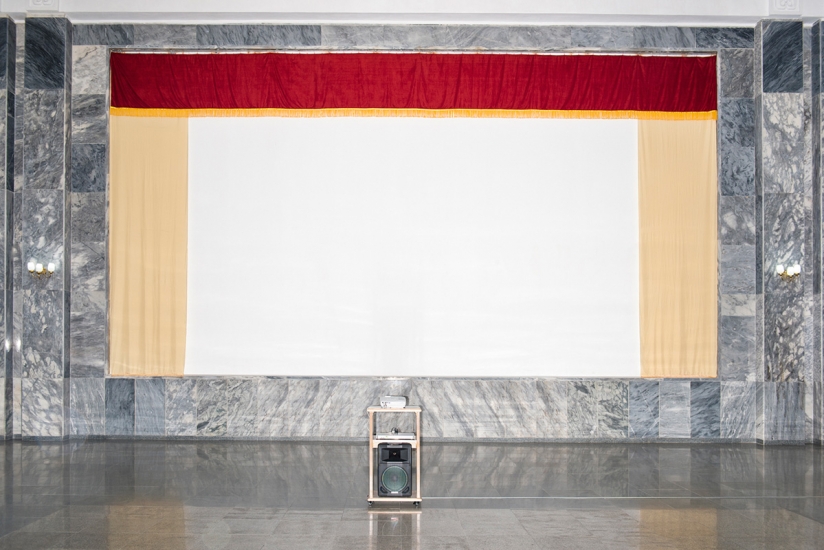
![]() |
| Christopher Colville: FLUX installed at photo-eye Gallery, Santa Fe, NM. On view through Saturday, June 22, 2019. |
It’s always compelling to engage with art that braids visual pleasure and conceptual expansion together. As someone who has been through art school, it’s especially exciting to come across work that truly presents itself as an unexpected mystery, an open question, in both meaning and how the work was created. For me, that’s exactly what Christopher Colville’s work does. His atmospheric, yet corporeal gunpowder-generated silver gelatin photographic images use light to point to darkness, examine landscape and objecthood through the abstract, confounding viewers about how a photograph could be made without a camera. I had the pleasure of meeting Christopher at the opening of
Flux, his solo exhibition currently on view at photo-eye Gallery, and spoke with him about his process, sources of inspiration, and cogitation behind his work in the show. He elaborates on these topics in our interview below:
Alexandra Jo: In one of your statements you mention that this method of working with gunpowder came out of a collaborative project with a poet, but its invention has deeper roots in your childhood: lighting fireworks and shooting empty shotgun shells with your father, and later, collecting small amounts of gunpowder from your father’s shotgun shells with your friends to experiment with making small sparks, smoke, and explosions. How important was that return to the curiosity, openness, and playfulness of childhood in creating this unique process? ![]() |
Christopher Colville
Photograph by Josh Loeser |
Christopher Colville: I am an idea-based artist who is driven by curiosity. I have a lot of questions about the world and the medium of photography and I am always looking for new ways to engage those questions. Remaining open to surprise and new experiences are the most important things I can do as an artist. Openness to surprise and the unknown is robust in childhood but often muted in adults. Maintaining a healthy sense of wonder and awe opens the door to new questions and ways of engaging the medium.
AJ: There is such a clean line between these materials and what you were doing with your friends as a kid… do you feel like this is a creative path you’ve been headed down since childhood or was there more of a sense of rediscovery/remembering?CC: There is a strangely clean line between my childhood experiments and the work I am doing today but it hasn’t always been the case. My work has taken a meandering path, I have taken on many jobs, engaging a variety of questions and making wildly different work, but I have always followed my curiosity. I grew up exploring the desert lots that surrounded my neighborhood, building forts in the dry river beds, searching for artifacts on hillsides and occasionally breaking the rules and blowing things up. I am the same person today. The freedom I had growing up formed my understanding of the world; it is less about returning to childhood curiosities, instead, it is about never having let go.
AJ: Has this process evolved in methodology and practical approach since its beginning? How so? Are the spirit of experimentation and openness to failure important?CC: It is important to me that the work is continually evolving both conceptually and physically. Once that stops it will be time to move on. In the early stages of this work, I was seduced by the volatility of the process and thrilled by anything that showed promise. Over time I have gained an understanding of materials while building a vocabulary of mark making to put to use in engaging larger questions. The work is still full of surprises and failure plays a huge role. I feel that we have to embrace failure because it provides an opportunity for understanding, it is necessary for growth, and discovery, and can be beautiful at times. It is important to jump head first into the unknown.…predictability is boring.
AJ: I feel like for many viewers the conversation around this work becomes very centered on process and figuring out exactly how the images are made. However, I feel a deeply meditative quality, an underlying concept and idea driving the work. Is there a specific connection between your process and your conceptual framework? Does your approach change from series to series conceptually, in practice, or in both ways? CC: The process of this work is engaging. Understanding how things are made provides an entry point for conversation, but the process is just the beginning. I dove into this work because I am interested in bigger questions. I am fascinated by the dual nature of creation and destruction, issues of power, violence, beauty and the sublime. I am interested in turning photography inside out and questioning issues of perception. Those willing to look beyond the initial spectacle of gunpowder and smoke often find more engaging conversations.
Each series within this work shifts to engage new questions. The genesis of the work was an exploration of the base elements of the photographic medium and over time the work has evolved to explore energy, fluid, motion, light, chaos, reactive materials, and violence. Early prints reference the vast darkness of the universe with celestial illusions. The
Dark Hours Horizons move toward meditative simplicity with prints that are reduced to a single line, a delineation. This single line disrupting the traditional flat surface of the paper, suggesting depth and the discovery of a landscape that does not exist. The most current work engages issues of violence, power and American volatility with images I find to be both horrifying and revelatory. The life-size human forms emerge from bullet-riddled acts of violence are much more complicated to deal with emotionally.
AJ: In one of your statements you use a quote from Blood Meridian
by Cormac McCarthy (which also happens to be one of my favorite lines from that book) that touches on our inability to perceive the strangeness and inevitable ephemerality and calamity in our world. There is a sense of the unknown and uncontrollable here that points to ideas like entropy and chaos. In a previous discussion, we had talked about McCarthy’s ability to capture darkness in a beautiful way, as he does in this quote. Do you think that dichotomy or tension between the inherent darkness/chaos of nature and traditional notions of “beauty” is important, or at least has a place, in your work?CC: I return to passages from
Blood Meridian often and every time I am filled with a sense of wonder and dread. McCarthy weaves beauty into the most debased acts of human nature calling attention to deeply problematic involvement in destruction; destruction that is often based in our compulsion to live. We are entangled in the strangenesses of the world that are both awe-inspiring and horrific. I believe this is a strangeness that we will never fully sort out, but through artwork, we can call attention to the contradictions and awaken a desire to be fully present and aware of the conflict that resides in our own belief systems. I believe this is particularly poignant for artists working in the landscape where lines are drawn and artists often choose sides. Our relationship to the land is complex and I want to reflect the totality of experience, taking responsibility for my actions but leaving room for a sense of wonder. Beauty can be a vehicle to span the gap, creating a rupture in our understanding.
It is human nature to be fascinated by the ugly or tragic. We are drawn to conflict and tragedy perhaps as a way of mitigating our own guilt or exercising our values. Maybe as a measure of our own moral compass, in an effort to feel better, feel lucky, feel happy. Artwork such as mine, and writing such as McCarthy’s may work in the opposite direction, seducing you in with beauty or fascination, but then the real exploration begins, the potential for discord and poignancy revealed.
William Kittredge writes in
The Nature of Generosity, “It’s in our nature to keep coming back, touching the wound, trying to heal ourselves.”
AJ: You mention in a piece of writing that you are drawn to the mystery of the desert, and many of the literary quotes that you highlight in various artist statements center around that specific landscape. Can you elaborate a bit more on that, and how it relates to your work?CC: I feel a deep connection to the desert. There is a freedom of spirit in the desert southwest that feeds my experimental tendencies. It is harsh, beautiful and full of contradictions. My work is a reflection of this space. I find nourishment in the freedom of vast open desert, expansive sky and ability to get lost in the landscape. On summer nights I ride desert trails cutting through the center of the fastest growing county in the country. These trails follow the ruins of the ancient Hohokam canals, linking swaths of desert preserves that appear as dark pools surrounded by the lights of the massive city. On the trails I encounter coyote, javelina, Gila monsters, all pronouncing that the wild spirit of the desert exists in the heart of a city of 4.3 million. The desert is truly a part of me, as I am a part of it. Nearly my entire existence has been an experience occurring in the desert. The openness of the land is critical. I need to work outdoors in the darkness of night in a space that I won’t bother neighbors with my slightly theatrical acts. Relocating elsewhere would primarily change me, which would undoubtedly change my art.
I have spent a great deal of time hiking a beautiful portion of land in southern Arizona that runs parallel to the US-Mexico border. Since 1941 the land has been used as a gunnery range providing training for aerial and air-to-ground combat. Sections are littered with unexploded ordnance and I have been told of a forest of gliders sticking out of the ground like oversized lawn darts after being pulled behind airplanes for target practice. The great contradiction is, this land is likely the most pristine, undeveloped portion of the Sonoran Desert. I am fascinated by spaces such as the gunnery range, spaces where history and mythology are embedded in the landscape. I often think about the Trinity site and scars both visible and unseen affected on the land in our attempts to exercise power and control. These things all influence my work. The gunpowder is, however, less about gunslingers and the wild west and more about energy, heat, power, creation, and consumption. I often use black powder, a composite discovered by alchemists searching for the elixir of life. What they found was not an elixir, but instead a reactive compound used for beautiful celebratory fireworks as well as a weapon that would kill untold numbers of people.
AJ: Furthermore, “Place” seems to be key also in the work’s physical creation… needing darkness to create the explosions, which make images on the photographic paper, and to develop them. You do all of this on-site. Does being in the openness of the desert influence the imagery? Do you think the work would change if the landscape around you were different?CC: I am still wrestling with the body of work titled
Beyond Reckoning. This work is challenging but I am coming to terms with it and excited about a group of images I haven’t shown, titled
Revenies. In addition, I am expanding the scale of work and chasing a number of new questions. I am not sure where they will take me but excited about the prospects. I was going to say I love this point in the working process, but when I shared this thought with my wife, she was correct in calling my bluff by saying,
Do you? Maybe you love some elements but let’s be honest, it causes a little anxiety—maybe you love that it forces you to sit down and read, forces you to go for desert adventures looking for new artifacts to ponder, forces you to write and get your thoughts out. But somehow I think this also ties into the conflict—you get comfortable with it all being “sorted out” and are looking for the conflict again.
She knows me better than anyone.
• • •
Christopher Colville: FLUX
On view through Saturday, June 22nd
For more information, and to purchase prints, please contact Gallery Staff at 505-988-5152 x202 or gallery@photoeye.com.
All works listed were available for at the time this post was published.